Choose the source of the data to view the statistics for. If you use multiple Turnitin products, pick the one which you would like to learn more about.
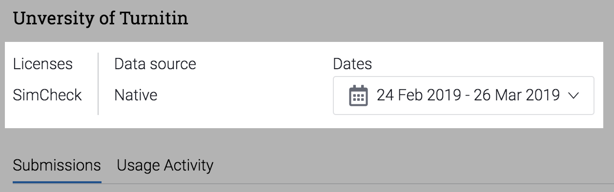
Looking for data from a specific date? Check our guide on how to filter by date.
Navigate to the Usage Activity tab.
The Similarity chart shows you a visual representation of similarity ranges found for documents submitted to the account during the specified dates. Hovering over the chart gives data for a specific date. Different colors denote the different similarity score ranges.
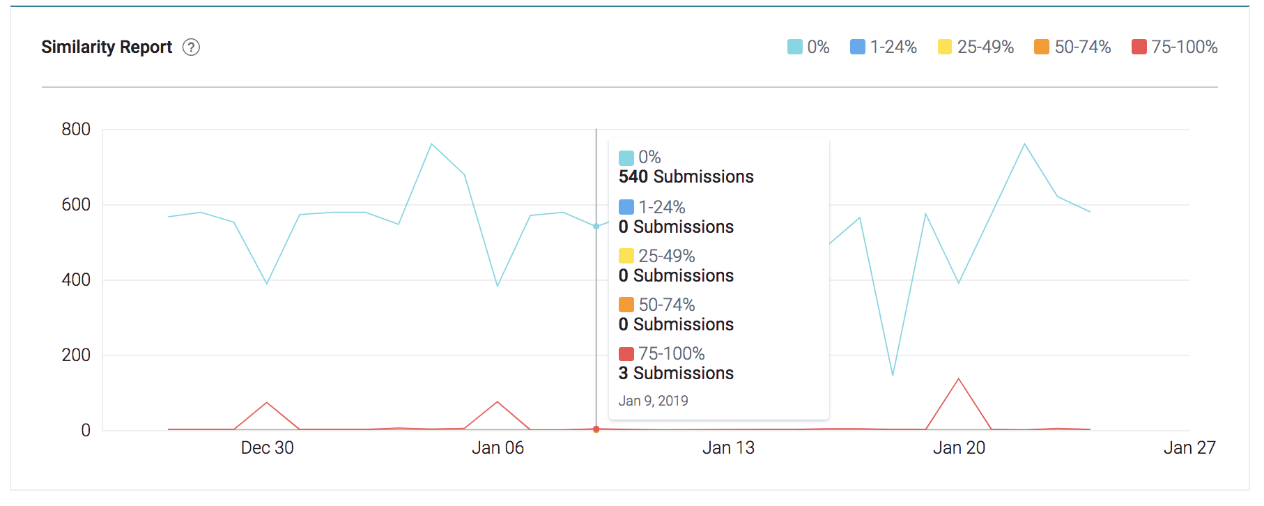
| Light blue: 0% matching text | |
| Dark blue: 1-24% matching text | |
| Yellow: 25-49% matching text | |
| Orange: 50-74% matching text | |
| Red: 75-100% matching text |